Cameras with bayer CMOS sensors can in certain circumstances suffer from an image artefact that appears as a grid pattern across the image. The actual artefact is normally the result of red and blue pixels that are brighter than they should be which gives a magenta type flare effect. However sometimes re-scaling an image containing this artefact can result in what looks like a grid type pattern as some pixels may be dropped or added together during the re scaling and this makes the artefact show up as a grip superimposed over the image.
Grid type artefact.
The cause of this artefact is most likely off-axis light somehow falling on the sensor. This off axis light could come from an internal reflection within the camera or the lens. It’s known that with the F5/F55 and FS7 cameras that a very strong light source that is just out of shot, just above or below the image frame can in some circumstances with some lenses result in this artefact. But this problem can occur with almost any CMOS Bayer camera, it’s not just a Sony problem.
The cure is actually very simple, use a flag or lens hood to prevent off axis light from entering the lens. This is best practice anyway.
So what’s going on, why does it happen?
When white light falls on a bayer sensor it passes through color filters before hitting the pixel that measures the light level. The color filters are slightly above the pixels. For white light the amount of light that passes through each color filter is different. I don’t know the actual ratios of the different colors, it will vary from sensor to sensor, but green is the predominant color with red and blue being considerably lower, I’ve used some made up values to illustrate what is going on, these are not the true values, but should illustrate the point.
In the illustration above when the blue pixel see’s 10%, green see 70% and red 20%, after processing the output would be white. If the light falling on the sensor is on axis, ie coming directly, straight through the lens then everything is fine.
But if somehow the light falls on the sensor off axis at an oblique angle then it is possible that the light that passes through the blue filter may fall on the green pixel, or the light from the green filter may fall on the red pixel etc. So instead of nice white light the sensor pixels would think they are seeing light with an unusually high red and blue component. If you viewed the image pixel for pixel it would have very bright red pixels, bright blue pixels and dark green pixels. When combined together instead of white you would get Pink or Blue. This is the kind of pattern that can result in the grid type artefact seen on many CMOS bayer sensors when there are problems with off axis light.
This is a very rare problem and only occurs in certain circumstances. But when it does occur it can spoil an otherwise good shot. It happens more with full frame lenses than with lenses designed for super 35mm or APSC and wide angles tend to be the biggest offenders as their wide Field of View (FoV) allows light to enter the optical path at acute angles. It’s a problem with DSLR lenses designed for large 4:3 shaped sensors rather than the various wide screen format that we shoot video in today. All that extra light above and below the desired widescreen frame, if it isn’t prevented from entering the lens has to go somewhere. Unfortunately once it enters the cameras optical path it can be reflected off things like the very edge of the optical low pass filter, the ND filters or the face of the sensor itself.
The cure is very simple and should be standard practice anyway. Use a sun shade, matte box or other flag to prevent light from out of the frame entering the lens. This will prevent this problem from happening and it will also reduce flare and maximise contrast. Those expensive matte boxes that we all like to dress up our cameras with really can help when used and adjusted correctly.
I have found that adding a simple mask in front of the lens or using a matte box such as any of the Vocas matte boxes with eyebrows will eliminate the issue. Many matte boxes will have the ability to be fitted with a 16:9 or 2.40:1 mask ( also know as Mattes hence the name Matte Box) ahead of the filter trays. It’s one of the key reason why Matte Boxes were developed.
Note the clamp inside the hood for holding a mask in front of the filters on this Vocas MB216 Matte Box. Not also how the Matte Box’s aperture is 16:9 rather than square to help cut out of frame light.Arri Matte Box with Matte selection.
You should also try to make sure the size of the matte box you use is appropriate to the FOV of the lenses that you are using. An excessively large Matte Box isn’t going to cut as much light as a correctly sized one. I made a number of screw on masks for my lenses by taking a clear glass or UV filter and adding a couple of strips of black electrical tape to the rear of the filter to produce a mask for the top and bottom of the lens. With zoom lenses if you make this mask such that it can’t be seen in the shot at the wide end the mask is effective throughout the entire zoom range.
Many cinema lenses include a mask for 17:9 or a similar wide screen aperture inside the lens.
Here are two sets of LUT’s for use in post production with the PXW-FS7, PMW-F5 and PMW-F55.
These LUT’s are based around the Sony 709(800) LUT and the Sony LC-709TypeA LUT (Arri Alexa look). But in addition to the base LUT designed for when you shoot at the native ISO there are LUTs for when you shoot at a lower or higher EI.
When you shoot at a high or low EI the resulting footage will be either under or over exposed when you add the standard LUT. These LUT’s include compensation for the under or overexposure giving the best possible translation from SGamut3.cine/S-log3 to rec-709 or the Alexa look and result in pleasing skin tones and a nice mid range with minimal additional grading effort.
If you find these LUT’s useful please consider buying me a coffee or beer.
Well I have set myself quite a challenge here as this is a tough one to describe and explain. Not so much perhaps because it’s difficult, but just because it’s hard to visualise, as you will see.
First of all the dictionary definition of Gamut is “The complete range or scope of something”.
In video terms what it means is normally the full range of colours and brightness that can be either captured or displayed.
I’m sure you have probably heard of the specification REC-709 before. Well REC-709, short for ITU-R Recommendation, Broadcast Television, number 709. This recommendation sets out the display of colours and brightness that a television set or monitor should be able to display. Note that it is a recommendation for display devices, not for cameras, it is a “display reference” and you might hear me talking about when things are “display referenced” ie meeting these display standards or “scene referenced” which would me shooting the light and colours in a scene as they really are, rather than what they will look like on a display.
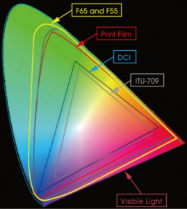
Anyway…. Perhaps you have seen a chart or diagram that looks like the one below before.
Sony colour gamuts.
Now this shows several things. The big outer oval shape is what is considered to be the equivalent to what we can see with our own eyes. Within that range are triangles that represent the boundaries of different colour gamuts or colour ranges. The grey coloured triangle for example is REC-709.
Something useful to know is that the 3 corners of each of the triangles are whats referred to as the “primaries”. You will hear this term a lot when people talk about colour spaces because if you know where the primaries (corners) are, by joining them together you can find the size of the colour space or Gamut and what the colour response will be.
Look closely at the chart. Look at the shades of red, green or blue shown at the primaries for the REC-709 triangle. Now compare these with the shades shown at the primaries for the much larger F65 and F55 primaries. Is there much difference? Well no, not really. Can you figure out why there is so little difference?
Think about it for a moment, what type of display device are you looking at this chart on? It’s most likely a computer display of some kind and the Gamut of most computer displays is the same size as that of REC-709. So given that the display device your looking at the chart on can’t actually show any of the extended colours outside of the grey triangle anyway, is it really any surprise that you can’t see much of a difference between the 709 primaries and the F65 and F55 primaries. That’s the problems with charts like this, they don’t really tell you everything that’s going on. It does however tell us some things. Lets have a look at another chart:
SGamuts Compared.
This chart is similar to the first one we looked at, but without the pretty colours. Blue is bottom left, Red is to the right and green top left.
What we are interested in here is the relationship between the different colour space triangles. Using the REC-709 triangle as our reference (as that’s the type of display most TV and video productions will be shown on) look at how S-Gamut and S-Gamut3 is much larger than 709. So S-Gamut will be able to record deeper, richer colours than 709 can ever hope to show. In addition, also note how S-Gamut isn’t just a bigger triangle, but it’s also twisted and distorted relative to 709. This is really important.
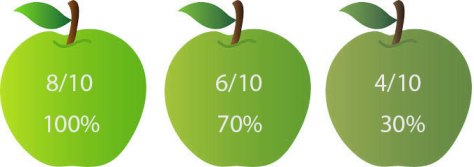
You may also want to refer to the top diagram as well as I do my best to explain this. The center of the overall gamut is white. As you draw a line out from the center towards the colour spaces primary the colour becomes more saturated (vivid). The position of the primary determines the exact hue or tone represented. Lets just consider green for the moment and lets pretend we are shooting a shot with 3 green apples. These apples have different amounts of green. The most vivid of the 3 apples has 8/10ths of what we can possibly see, the middle one 6/10ths and the least colourful one 4/10ths. The image below represents what the apples would look like to us if we saw them with our eyes.
The apples as we would see them with our own eyes.
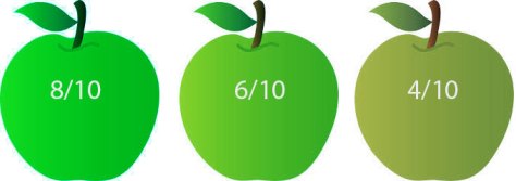
If we were shooting with a camera designed to match the 709 display specification, which is often a good idea as we want the colours to look right on the TV, the the greenest, deepest green we can capture is the 709 green primary. lets consider the 709 green primary to be 6/10ths with 10/10ths being the greenest thing a human being can see. 6/10ths green will be recorded at our peak green recording level so that when we play back on a 709 TV it will display the greenest the most intense green that the display panel is capable of. So if we shoot the apples with a 709 compatible camera, 6/10ths green will be recorded at 100% as this is the richest green we can record (these are not real levels, I’m just using them to illustrate the principles involved) and this below is what the apples would look like on the TV screen.
6/10ths Green and above recorded at 100% (our imaginary rec-709)
So that’s rec-709, our 6/10ths green apple recorded at 100%. Everything above 6/10 will also be 100% so the 8/10th and 6/10ths green apples will look more or less the same.
What happens then if we record with a bigger Gamut. Lets say that the green primary for S-Gamut is 8/10ths of visible green. Now when recording this more vibrant 8/10ths green in S-Gamut it will be recorded at 100% because this is the most vibrant green that S-Gamut can record and everything less than 8/10 will be recorded at a lower percentage.
But what happens if we play back S-Gamut on a 709 display? Well when the 709 display sees that 100% signal it will show 6/10ths green, a paler less vibrant shade of green than the 8/10ths shade the camera captured because 6/10ths is the most vibrant green the display is capable of. All of our colours will be paler and less rich than they should be.
The apples recorded using a big gamut but displayed using 709 gamut.
So that’s the first issue when shooting with a larger colour Gamut than the Gamut of the display device, the saturation will be incorrect, a dark green apple will be pale green. OK, that doesn’t sound like too big a problem, why don’t we just boost the saturation of the image in post production? Well if the display is already showing our 100% green S-Gamut signal at the maximum it can show (6/10ths for Rec-709) then boosting the saturation won’t help colours that are already at the limit of what the display can show simply because it isn’t capable of showing them any greener than they already look. Boosting the saturation will make those colours not at the limit of the display technology richer, but those already at the limit won’t get any more colourful. So as we boost the saturation any pale green apples become greener while the deep green apples stay the same so we loose colour contrast between the pale and deep green apples. The end result is an image that doesn’t really look any different that it would have done if shot in Rec-709.
Saturation boosted S-Gamut looks little different to 709 original.Sony colour gamuts.
But, it’s even worse that just a difference to the saturation. Look at the triangles again and compare 709 with S-Gamut. Look at how much more green there is within the S-Gamut colour soace than the 709 colour space compared to red or blue. So what do you think will happen if we try to take that S-Gamut range and squeeze it in to the 709 range? Well there will be a distinct colour shift towards green as we have a greater percentage of green in S-Gamut than we should have in Rec-709 and that will generate a noticeable colour shift and the skewing of colours.
Squeezing S-Gamut into 709 will result in a colour shift.
This is where Sony have been very clever with S-Gamut3. If you do take S-Gamut and squeeze it in to 709 then you will see a colour shift (as well as the saturation shift discussed earlier). But with S-Gamut3 Sony have altered the colour sampling within the colour space so that there is a better match between 709 and S-Gamut3. This means that when you squeeze S-Gamut3 into 709 there is virtually no colour shift. However S-Gamut3 is still a very big colour space so to correctly use it in a 709 environment you really need to use a Look Up Table (LUT) to re-map it into the smaller space without an appreciable saturation loss, mapping the colours in such a way that a dark green apple will still look darker green than a light green apple but keeping within the boundaries of what a 709 display can show.
Taking this one step further, realising that there are very few, if any display devices that can actually show a gamut as large as S-Gamut or S-Gamut3, Sony have developed a smaller Gamut known as S-Gamut3.cine that is a subset of S-Gamut3.
The benefit of this smaller gamut is that the red green and blue ratios are very close to 709. If you look at the triangles you can see that S-Gamut3.cine is more or less just a larger version of the 709 triangle. This means that colours shifts are almost totally eliminated making this gammut much easier to work with in post production. It’s still a large gamut, bigger than the DCI-P3 specification for digital cinema, so it still has a bigger colour range than we can ever normally hope to see, but as it is better aligned to both P3 and rec-709 colourists will find it much easier to work with. For productions that will end up as DCI-P3 a slight saturation boost is all that will be needed in many cases.
So as you can see, having a huge Gamut may not always be beneficial as often we don’t have any way to show it and simply adding more saturation to a seemingly de-saturated big gamut image may actually reduce the colour contrast as our already fully saturated objects, limited by what a 709 display can show, can’t get any more saturated. In addition a gamut such as S-Gamut that has a very different ratio of R, G and B to that of 709 will introduce colour shifts if it isn’t correctly re-mapped. This is why Sony developed S-Gamut3.cine, a big but not excessively large colour space that lines up well with both DCI-P3 and Rec-709 and is thus easier to handle in post production.
It’s been brought to my attention that there is a lot of concern about the apparent noise levels when using Sony’s new Slog3 gamma curve. The problem being that when you view the ungraded Slog3 it appears to have more noise in the shadows than Slog2. Many are concerned that this “extra” noise will end up making the final pictures nosier. The reality is that this is not the case, you won’t get any extra noise using Slog3 over Slog2. Because S-Log3 is closer to the log gamma curves used in other cameras many people find that Slog3 is generally easier to grade and work with in post production.
So what’s going on?
Slog3 mimics the Cineon Log curve, a curve that was originally designed, back in the 1980’s to match the density of film stocks. As a result the shadow and low key parts of the scene are shown and recorded at a brighter level than Slog2. S-Log2 was designed from the outset to work with electronic sensors and is optimised for the way an electronic sensor works rather than film. Because the S-Log3 shadow range has more gain than S-log2, the shadows end up a bit brighter than it perhaps they really needs to be and because of the extra gain the noise in the shadows appears to be worse. The noise level might be a bit higher but the important thing, the ratio between wanted picture information and un wanted noise is exactly the same whether in Slog2 or Slog3.
Let me explain:
The signal to noise ratio of a camera is determined predominantly by the sensor itself and how the sensor is read. This is NOT changing between gamma curves.
The other thing that effects the signal to noise ratio is the exposure level, or to be more precise the aperture and how much light falls on the sensor. This should be same for Slog2 and Slog3. So again no change there.
As these two key factors do not change when you switch between Slog2 and slog3, there is no change in the signal to noise ratio between Slog2 and Slog3. It is the ratio between wanted picture information and noise that is important. Not the noise level, but the ratio. What people see when they look at ungraded SLog3 is a higher noise level simply because ALL the signal levels are also higher, both noise and desirable image information. So the ratio between the wanted signal and the noise is actually no different for both Slog2 and Slog3.
Gamma is just gain, nothing more, nothing less, just applied by variable amounts at different levels. In the case of log, the amount of gain decreases as you go further up the curve.
Increasing or decreasing gain does NOT significantly change the signal to noise ratio of a digital camera (or any other digital system). It might make noise more visible if you are amplifying the image more than normal in an underexposure situation where you are using that extra gain to compensate for not enough light. But the ratio between the dark object and the noise does not change, it’s just that as you have made the dark object brighter by adding gain, you have also made the noise brighter by the same amount, so the noise also becomes brighter and thus more obvious.
Lets take a look at some Math. I’ll keep it very simple, I promise!
Just for a moment to keep things simple, lets say some camera has a signal to noise ratio of 3:1 (SNR is normally measured in db, but I’m going to keep things really simple here).
So, from the sensor if my picture signal is 3 then my noise will be 1.
If I apply Gamma Curve “A” which has 2x gain then my picture becomes 6 and my noise becomes 2. The SNR is 6:2 = 3:1
If I apply Gamma Curve “B” which has 3x gain then my picture becomes 9 and my noise becomes 3. The SNR is 9:3 = 3:1 so no change to the ratio, but the noise is now 3 with gamma B compared to Gamma A where it is 2, so the gamma B image will appear at first glance to be noisier.
Now we take those imaginary clips in to post production:
In post we want to grade the shots so that we end up with the same brightness of image, so lets say our target level after grading is 12.
For the gamma “A” signal we need to add 3x gain to take 6 to 18. As a result the noise now becomes 6 (3 x 2 = 6).
For the gamma “B” signal (our noisy looking one) we need to use less gain in post, only 2x gain, to take 9 to 18. When we apply 2x gain our noise for gamma B becomes 6 (2 x 3 = 6).
Notice anything? In both cases the noise in the final image is exactly the same, in both cases the final image level is 18 and the final noise level is 6, even though the two recordings started at different levels with one appearing noisier than the other.
OK, so that’s the theory, what about in practice?
Take a look at the images below. These are 400% crops from larger frames. Identical exposure, workflow and processing for each. You will see the original Slog2 and SLog3 plus the Slog 2 and Slog 3 after applying the LC-709 LUT to each in Sony’s raw viewer. Nothing else has been done to the clips. You can “see” more noise in the raised shadows in the untouched SLog3, but after applying the LUTs the noise levels are the same. This is because the Signal to Noise ratio of both curves is the same and after adding the LUT’s the total gain applied (camera gain + LUT gain) to get the same output levels is the same.
It’s interesting to note in these frame grabs that you can actually see that in fact the S-Log3 final image looks if anything a touch less noisy. The bobbles and the edge of the picture frame look better in the Slog3 in my opinion. This is probably because the S-Log3 recording uses very slightly higher levels in the shadow areas and this helps reduce compression artefacts.
The best way to alter the SNR of a typical video system (other than through electronic noise reduction) is by changing the exposure, which is why EI (Exposure Index) and exposure offsets are so important and so effective.
Slog3 has a near straight line curve above middle grey. This means that in post production it’s easier to grade as adjustments to one part of the image will have a similar effect to other parts of the image. It’s also very, very close to Cineon and to Arri Log C and in many cases LUT and grades designed for these gammas will also work pretty well with SLog3.
The down side to Slog3?
Very few really. Fewer data points are recorded for each stop in the brighter parts of the picture and highlight range compared to Slog2. This doesn’t change the dynamic range but if you are using a less than ideal 8 bit codec you may find S-Log2 less prone to banding in the sky or other gradients compared to S-Log3. With a 10 bit recording, in a decent workflow, it makes very little difference.
When an engineer designs a gamma curve for a camera he/she will be looking to achieve certain things. With Sony’s Hypergammas and Cinegammas one of the key aims is to capture a greater dynamic range than is possible with normal gamma curves as well as providing a pleasing highlight roll off that looks less electronic and more natural or film like.
Recording a greater dynamic range into the same sized bucket.
To achieve these things though, sometimes compromises have to be made. The problem being that our recording “bucket” where we store our picture information is the same size whether we are using a standard gamma or advanced gamma curve. If you want to squeeze more range into that same sized bucket then you need to use some form of compression. Compression almost always requires that you throw away some of your picture information and Hypergamma’s and Cinegamma’a are no different. To get the extra dynamic range, the highlights are compressed.
Compression point with Hypergamma/Cinegamma.
To get a greater dynamic range than normally provided by standard gammas the compression has to be more aggressive and start earlier. The earlier (less bright) point at which the highlight compression starts means you really need to watch your exposure. It’s ironic, but although you have a greater dynamic range i.e. the range between the darkest shadows and the brightest highlights that the camera can record is greater, your exposure latitude is actually smaller, getting your exposure just right with hypergamma’s and cinegamma’s is very important, especially with faces and skin tones. If you overexpose a face when using these advanced gammas (and S-log and S-log2 are the same) then you start to place those all important skin tone in the compressed part of the gamma curve. It might not be obvious in your footage, it might look OK. But it won’t look as good as it should and it might be hard to grade. It’s often not until you compare a correctly exposed sot with a slightly over shot that you see how the skin tones are becoming flattened out by the gamma compression.
But what exactly is the correct exposure level? Well I have always exposed Hypergammas and Cinegammas about a half to 1 stop under where I would expose with a conventional gamma curve. So if faces are sitting around 70% with a standard gamma, then with HG/CG I expose that same face at 60%. This has worked well for me although sometimes the footage might need a slight brightness or contrast tweak in post the get the very best results. On the Sony F5 and F55 cameras Sony present some extra information about the gamma curves. Hypergamma 3 is described as HG3 3259G40 and Hypergamma 4 is HG4 4609G33. What do these numbers mean? lets look at HG3 3259G40
The first 3 numbers 325 is the dynamic range in percent compared to a standard gamma curve, so in this case we have 325% more dynamic range, roughly 2.5 stops more dynamic range. The 4th number which is either a 0 or a 9 is the maximum recording level, 0 being 100% and 9 being 109%. By the way, 109% is fine for digital broadcasting and equates to bit 255 in an 8 bit codec. 100% may be necessary for some analog broadcasters. Finally the last bit, G40 is where middle grey is supposed to sit. With a standard gamma, if you point the camera at a grey card and expose correctly middle grey will be around 45%. So as you can see these Hypergammas are designed to be exposed a little darker. Why? Simple, to keep skin tones away from the compressed part of the curve.
Here are the numbers for the 4 primary Sony Hypergammas:
Cinegammas are designed to be graded. The shape of the curve with steadily increasing compression from around 65-70% upwards tends to lead to a flat looking image, but maximises the cameras latitude (although similar can be achieved with a standard gamma and careful knee setting). The beauty of the cinegammas is that the gentle onset of the highlight compression means that grading will be able to extract a more natural image from the highlights. Note than Cinegamma 2 is broadcast safe and has slightly reduced recording range than CG 1,3 and 4.
Standard gammas will give a more natural looking picture right up to the point where the knee kicks in. From there up the signal is heavily compressed, so trying to extract subtle textures from highlights in post is difficult. The issue with standard gammas and the knee is that the image is either heavily compressed or not, there’s no middle ground.
In a perfect world you would control your lighting (turning down the sun if necessary ;-o) so that you could use standard gamma 3 (ITU 709 standard HD gamma) with no knee. Everything would be linear and nothing blown out. This would equate to a roughly 7 stop range. This nice linear signal would grade very well and give you a fantastic result. Careful use of graduated filters or studio lighting might still allow you to do this, but the real world is rarely restricted to a 7 stop brightness range. So we must use the knee or Cinegamma to prevent our highlights from looking ugly.
If you are committed to a workflow that will include grading, then Cinegammas are best. If you use them be very careful with your exposure, you don’t want to overexpose, especially where faces are involved. getting the exposure just right with cinegammas is harder than with standard gammas. If anything err on the side of caution and come down 1/2 a stop.
If your workflow might not include grading then stick to the standard gammas. They are a little more tolerant of slight over exposure because skin and foliage won’t get compressed until it gets up to the 80% mark (depending on your knee setting). Plus the image looks nicer straight out of the camera as the cameras gamma should be a close match to the monitors gamma.
Manage your privacy
To provide the best experiences, we use technologies like cookies to store and/or access device information. Consenting to these technologies will allow us to process data such as browsing behavior or unique IDs on this site. Not consenting or withdrawing consent, may adversely affect certain features and functions.
Functional
Always active
The technical storage or access is strictly necessary for the legitimate purpose of enabling the use of a specific service explicitly requested by the subscriber or user, or for the sole purpose of carrying out the transmission of a communication over an electronic communications network.
Preferences
The technical storage or access is necessary for the legitimate purpose of storing preferences that are not requested by the subscriber or user.
Statistics
The technical storage or access that is used exclusively for statistical purposes.The technical storage or access that is used exclusively for anonymous statistical purposes. Without a subpoena, voluntary compliance on the part of your Internet Service Provider, or additional records from a third party, information stored or retrieved for this purpose alone cannot usually be used to identify you.
Marketing
The technical storage or access is required to create user profiles to send advertising, or to track the user on a website or across several websites for similar marketing purposes.